

Pantone's Color of the Year - Cloud Dancer
- Jan Peterson

- Jan 26
- 3 min read
Each December Pantone announces their color of their year. The process involves looking at style trends in fashion, art and design, as well as global influences such as social movements, technology and environmental issues. A panel of color experts votes on colors to come up with a shade that reflects cultural relevance, versatility and visual impact. This year Pantone has chosen Cloud Dancer - a shade of white.
What's behind the choice
Using the tagline A whisper of tranquility and peace in a noisy world, Pantone describes the color as: "A lofty white that serves as a symbol of calming influence in a society rediscovering the value of quiet reflection. A billowy white imbued with serenity, PANTONE 11-4201 Cloud Dancer encourages true relaxation and focus, allowing the mind to wander and creativity to breathe, making room for innovation."
Pantone's Executive Director, Leatrice Eiseman, summarizes the organization's choice this way: "The cacophony that surrounds us has become overwhelming, making it harder to hear the voices of our inner selves. PANTONE 11-4201 Could Dancer enhances our focus, providing release from the distraction of external influences. It is a conscious statement of simplification. At this time of transformation, when we are reimagining our future and our place in the world, PANTONE 11-4201 Cloud Dancer is a discrete white hue offering a promise of clarity.”
Pro's and con's
This year's winner has gotten mixed reviews from style editors and florists - especially on social media. Critics have called it a "non-color", flavorless", "elitist", "cop out" and "boring", while others agree with the choice. According to a recent article in the Society of American Florists, the reviews are mixed:
“I wait for this Pantone announcement every year like Christmas. I feel like I opened an empty box that accidentally got wrapped! White is sorted laundry and printer paper. Just turn on some white noise and enjoy some white bread.” - Jodi Duncan, AIFD
“White isn’t the absence of color. It’s the stage that allows everything else to shine. Used alone, it feels calm and intentional; paired with other hues it creates balance and harmony, offering a timeless but emotionally resonant direction for floral design." - Leanne Kesler, AAF, AIFD, CEJ, FDI, PFCI
“All white flowers have been the staple of our high-end offerings. Picture a bouquet of lilacs, ranunculus, lily of the valley, helleborus, roses and a cloud of baby’s breath. How fashionable is that?” - Talmage McLaurin, AIFD,
“There are numerous opportunities to enhance floral designs and displays, from naturalistic designs using fillers like ginestra, baby’s breath, and heather, to classic arrangements featuring one of my favorites, gardenias, or roses, lilies, callas, hydrangeas and stephanotis. Even tropical design styles have white options with anthurium and orchids.” - Joyce Mason-Monheim, AAF, AIFD, AzMF, PFCI,
"White is a really essential color in design. It's a perfect contrast hero. White amplifies whatever sits near it — color, texture, shadow, shine. White creates breathing room for the eye. It removes visual noise and lets every intentional detail feel expensive, elevated and editorial. In luxury design, space is the flex. White surfaces bounce light beautifully, lifting a design and giving it that floating, weightless feeling. And on a deeper or more symbolic level, white represents purity and new beginnings.” - Natalie Blooms
What are your thoughts?
While I am surprised white was chosen as the color of the year - I happen to think it is the one shade you can build every design from. To me it's a blank slate especially in home design and there are so many beautiful white flowers on the market today. I am a sucker for a white arrangement filled with gorgeous blossoms. I use a lot of white in my home. I've collected white ironstone for years and white is the basis of most of my color schemes. How about you?
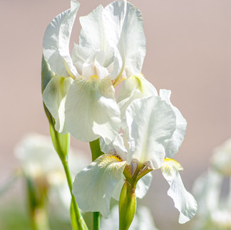
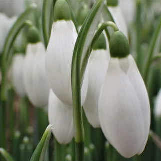
Here's a little floral inspiration to celebrate Pantone's Cloud Dancer:


"Colors, like features, follow the changes of the emotions."
Pablo Picasso


Comments